KUT / KUTX
Brand Identity Development
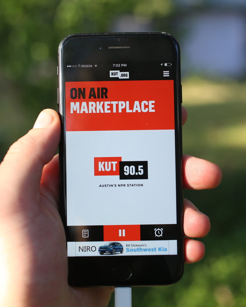
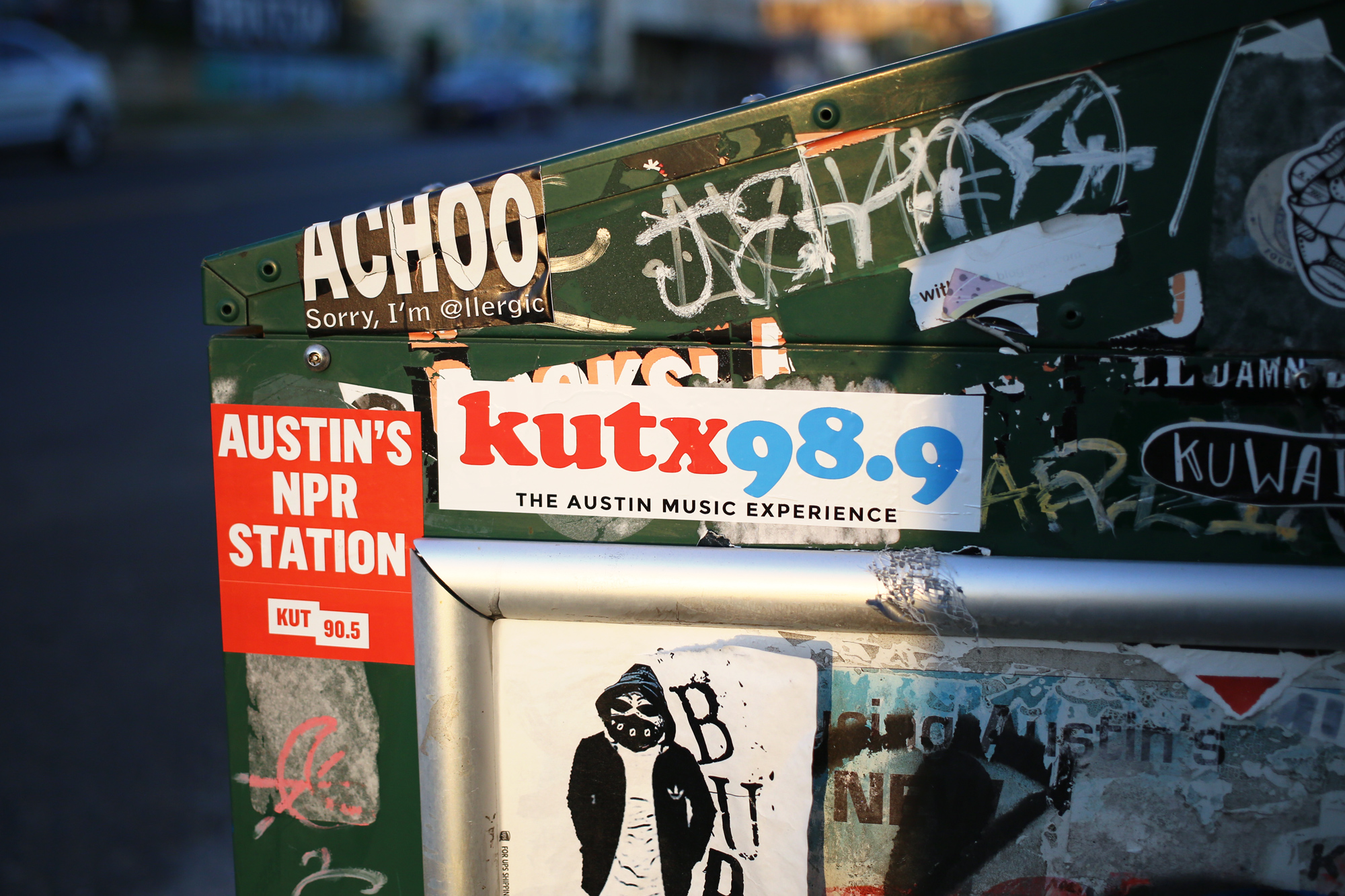
While working at Page/Dyal I had the special opportunity to redesign the brand identity for an inspirational cultural institution, KUT and KUTX, Austin's Public Radio. The presence of Austin's music scene is no secret but until recently there was only a single station to serve the community news as well as music. Our rebrand focused on creating unique identities for each station while maintaining elements of graphic similarities between these siblings.
Through a series of initial conversations with DJ's, marketers, and executives from the station, we established two very straight-forward objectives for the redesign of KUT's brand identity—create a mark that was strong, clear, and memorable to focus on the call sign and numbers of the station; and allow for a subtle nod to the station's dedication to journalism with depth and perspective.
Our graphic identity system needed to work for a variety of applications while never using more than two colors. As a public institution, operating solely on financial donations from the community, the perception of efficiency was of the utmost importance.
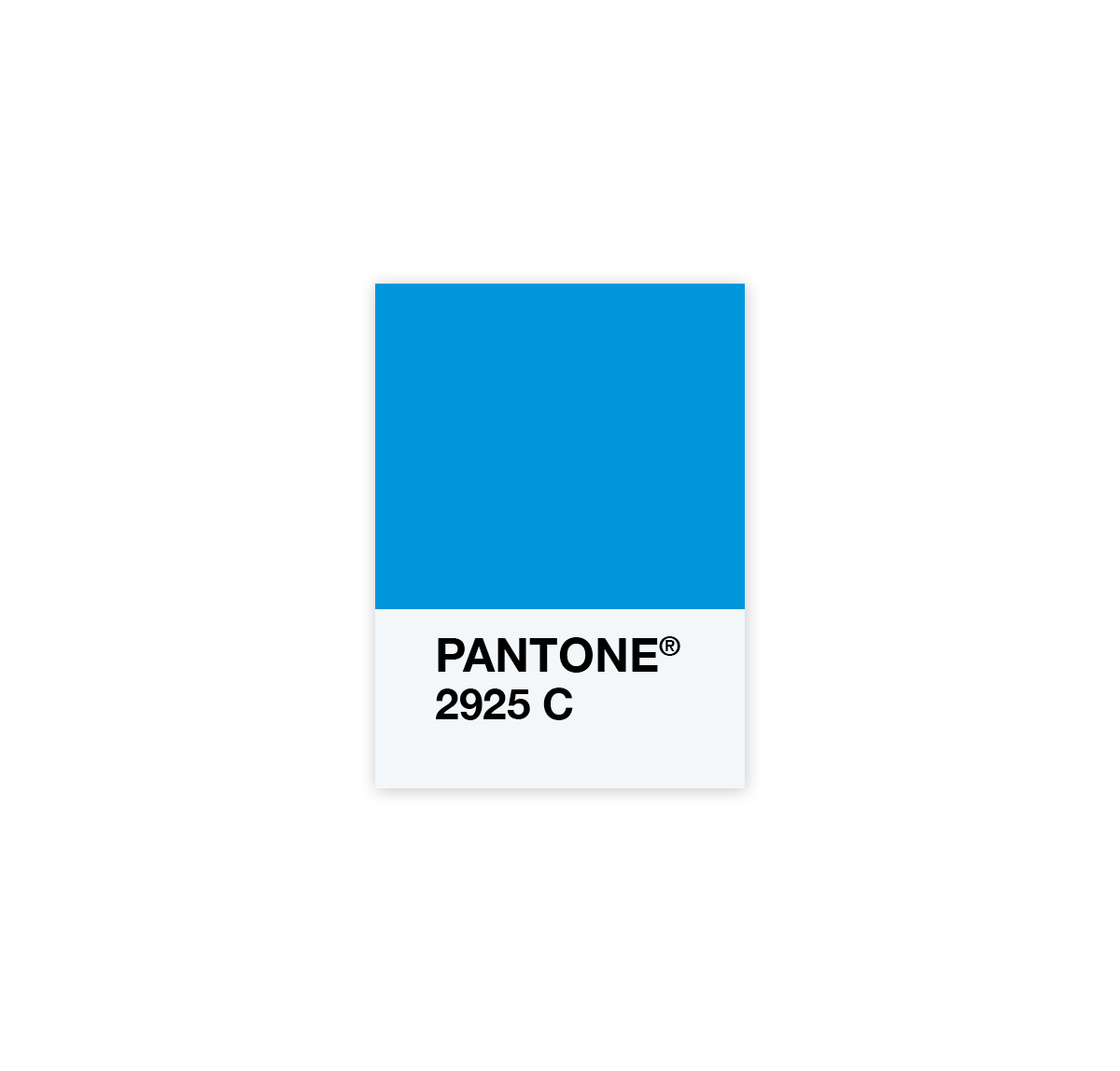
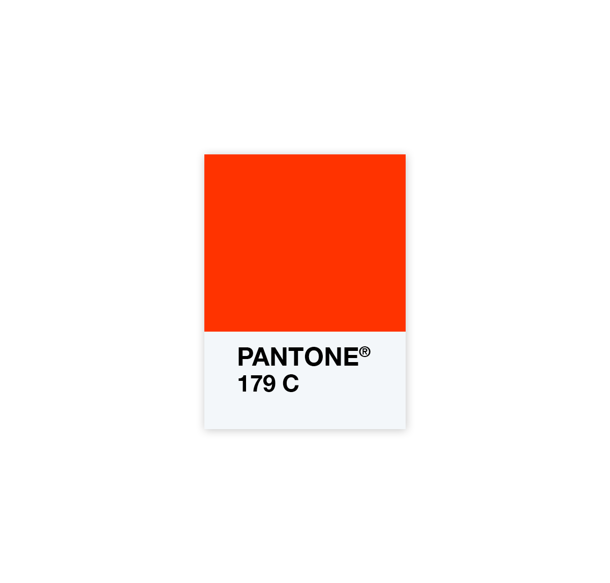
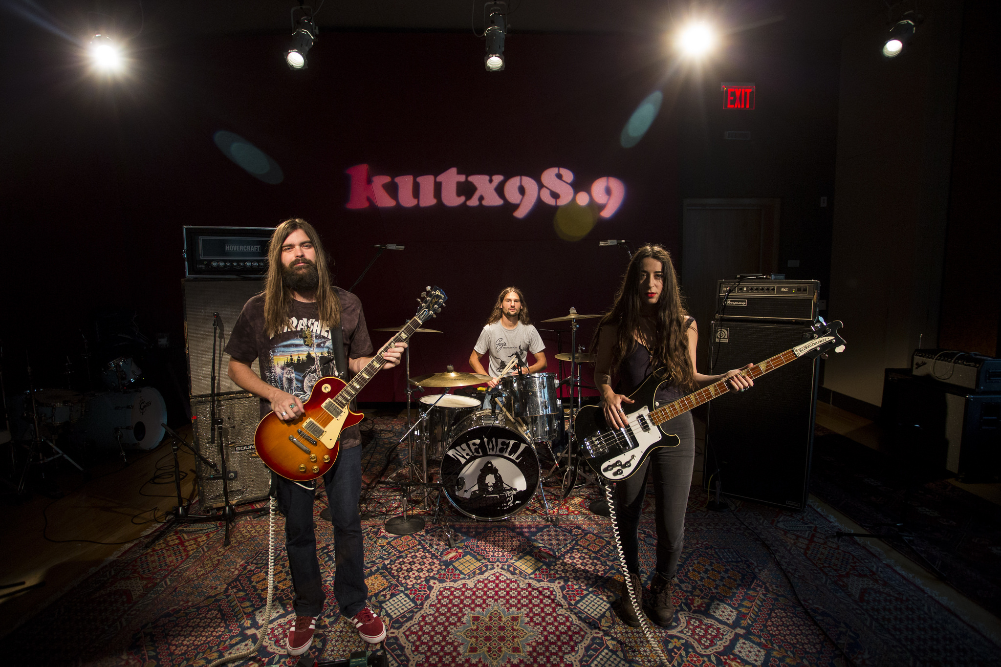
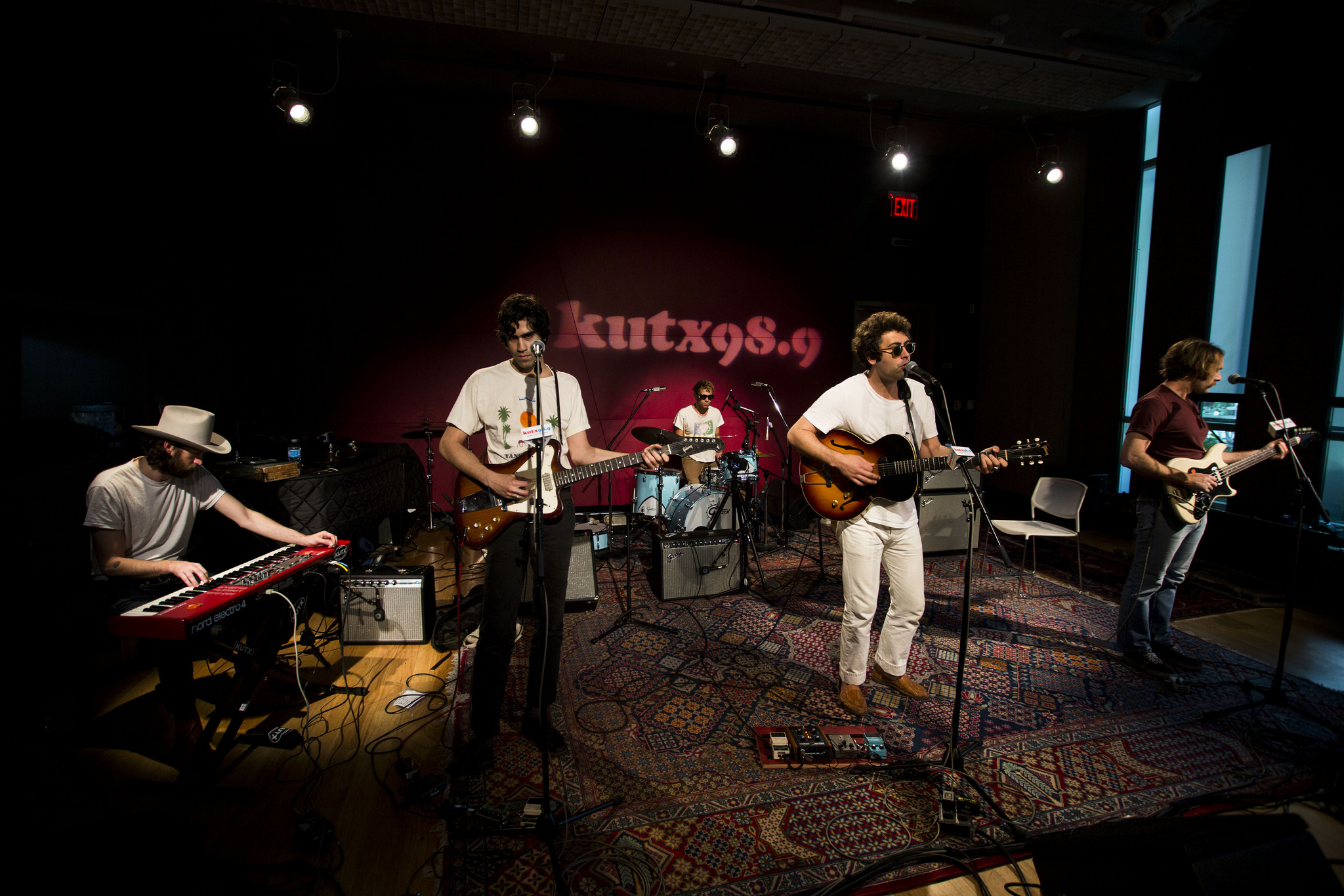
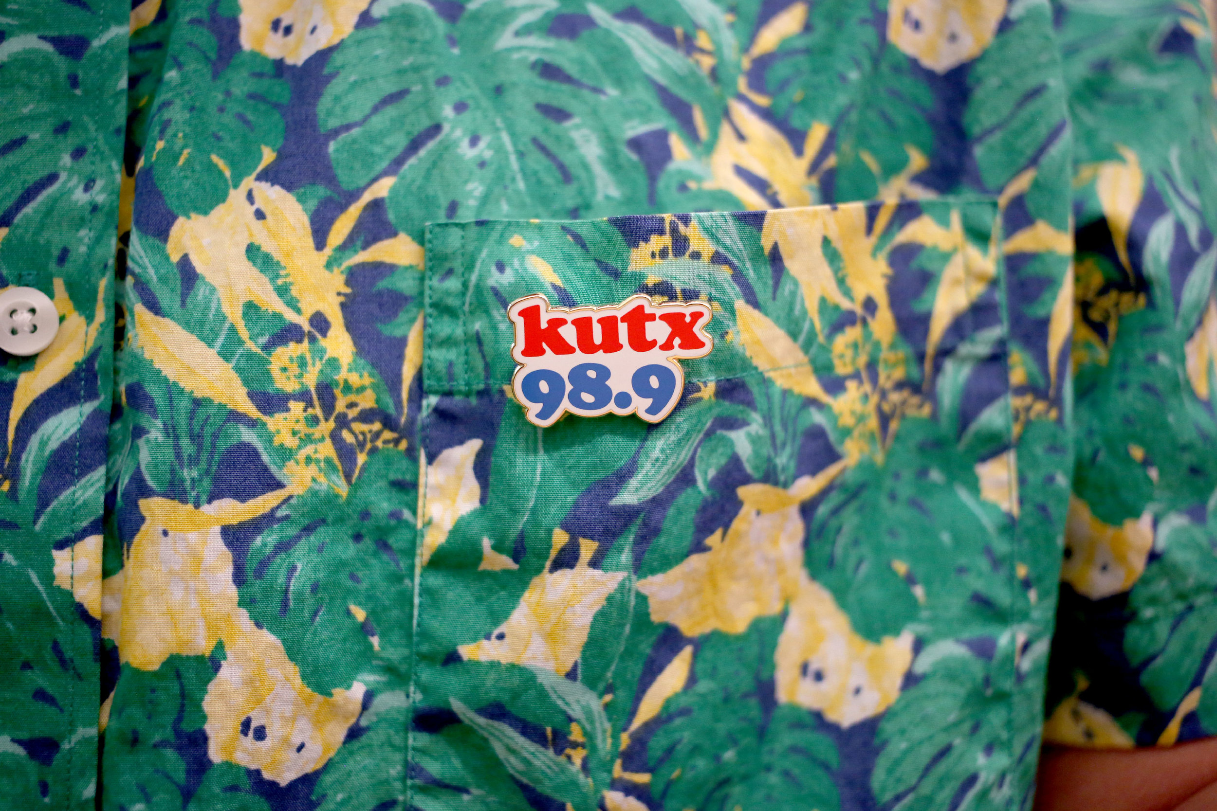
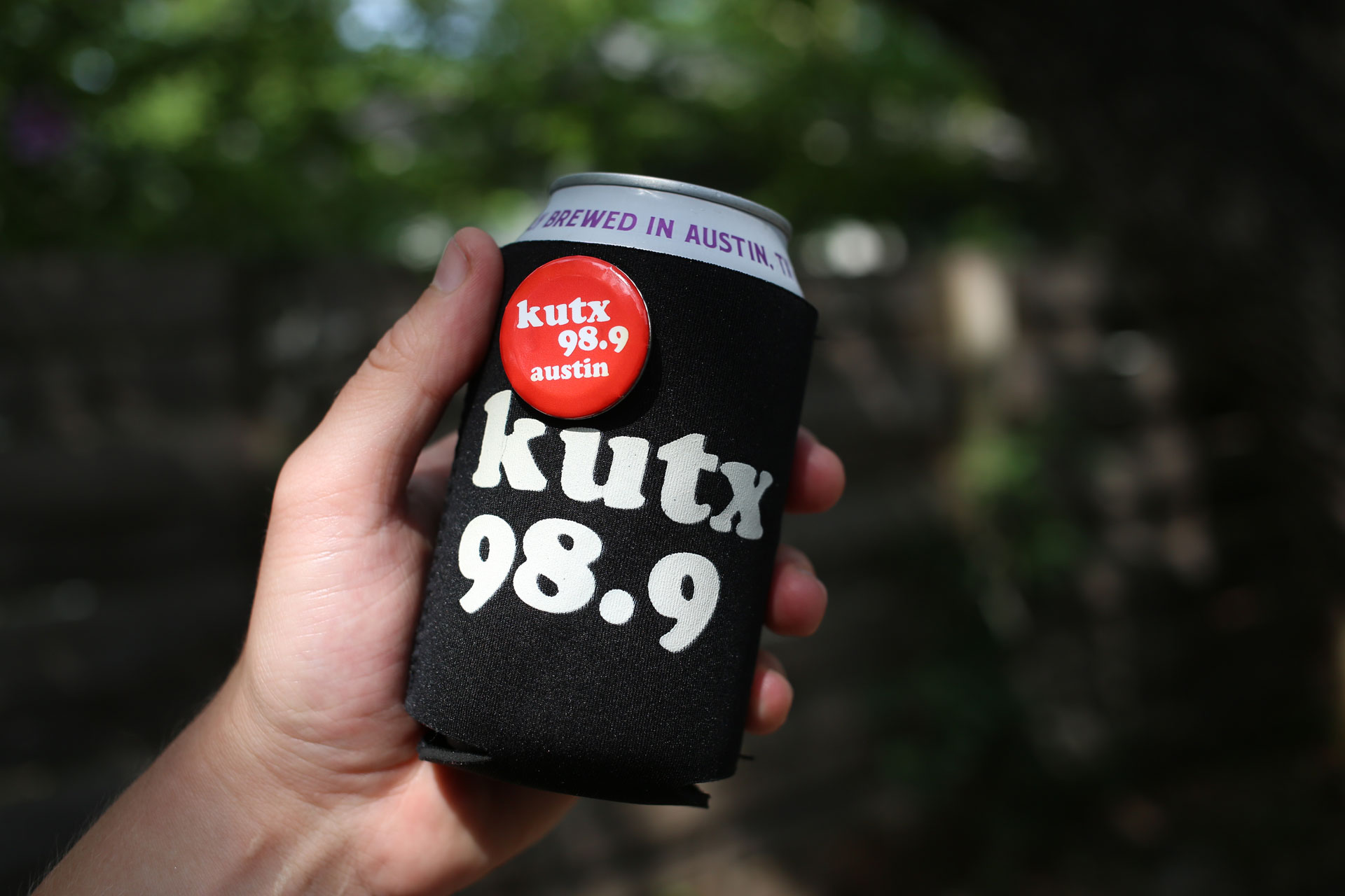
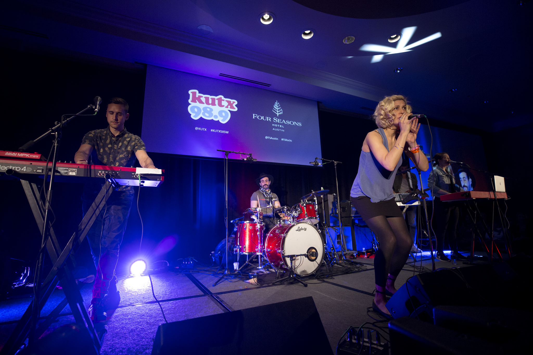
KUTX is the free spirit of the family and needed a visual identity to reflect that. The classic let your hair down type solution of Cooper Black paired with simple primary colors was full heartedly embraced by the KUTX team. It gave them a system that they could continue to adapt to their needs with all the personality they deserve.


